Using the Controller for font size and screen appearance

Tap this CONTROLLER BUTTON to open up the accessibility toolbar:
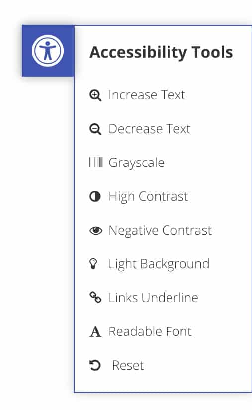
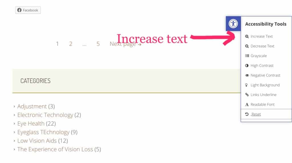
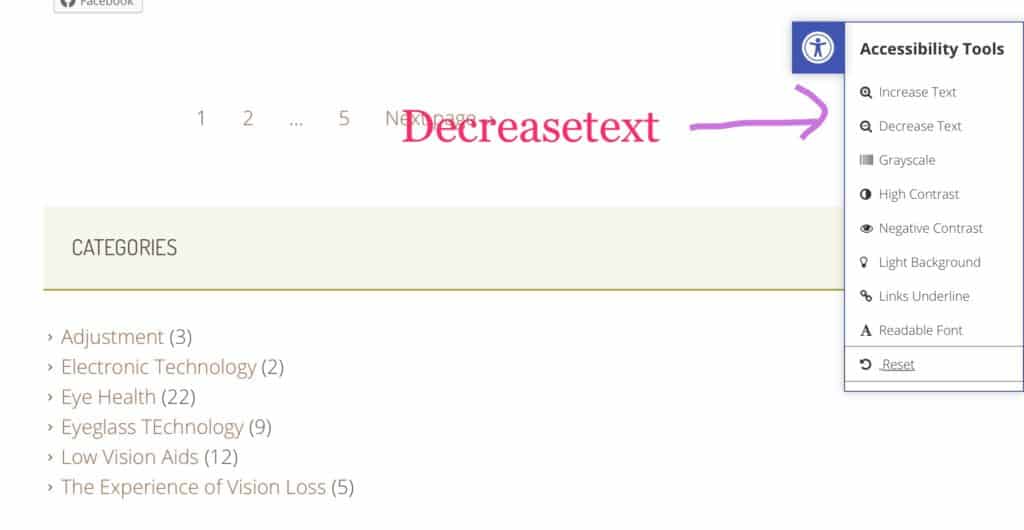
The First and second options are: INCREASE TEXT and DECREASE TEXT. tap on these options, several times, to reach desired print size:
Next is GREY SCALE, which changes the page to black, white and grey, even the images:

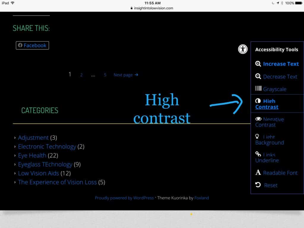
Next in line is HIGH CONTRAST Blue print on a black background, the images maintain their original color.
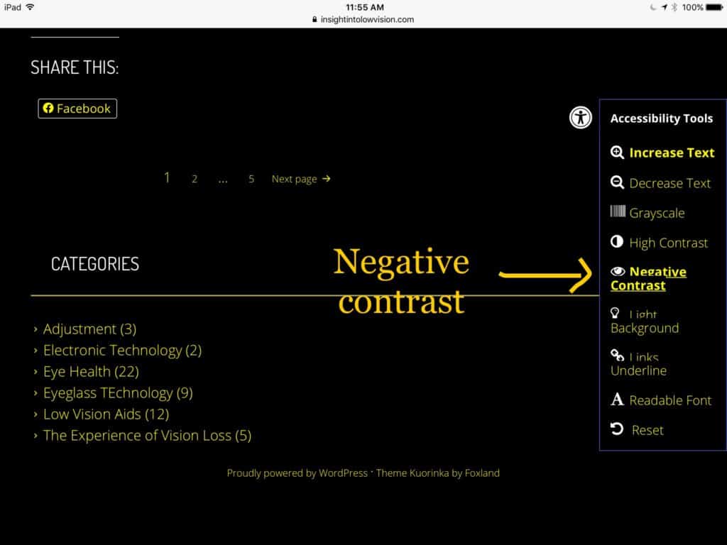
or NEGATIVE CONTRAST, which is yellow print on black:
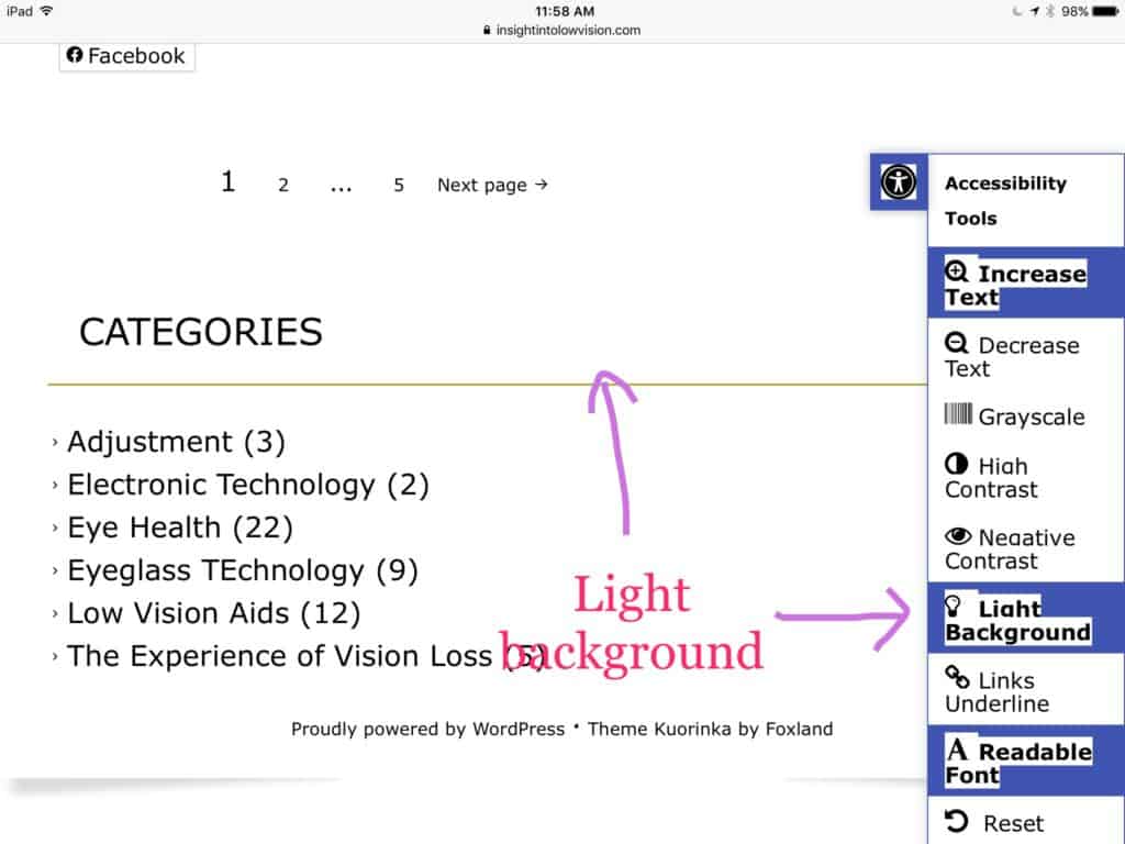
LIGHT BACKGROUND gets rid of any shading.
LINKS UNDERLINE is self explanatory. Helps you identify links to easily connect to additional information.
Next is my favorite, and the most useful: READABLE FONT:
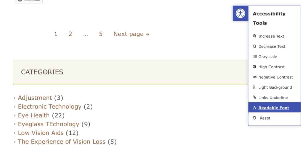
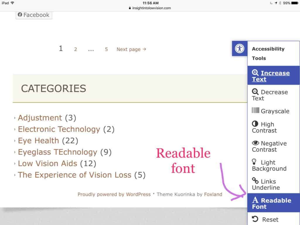
Notice in the above image the font appears “fine.” When READABLE FONT is tapped, the font is bolder and easier to read:
Finally, if you don’t like the changes you made, the RESET button is the last on the column!
I hope this helps. TC